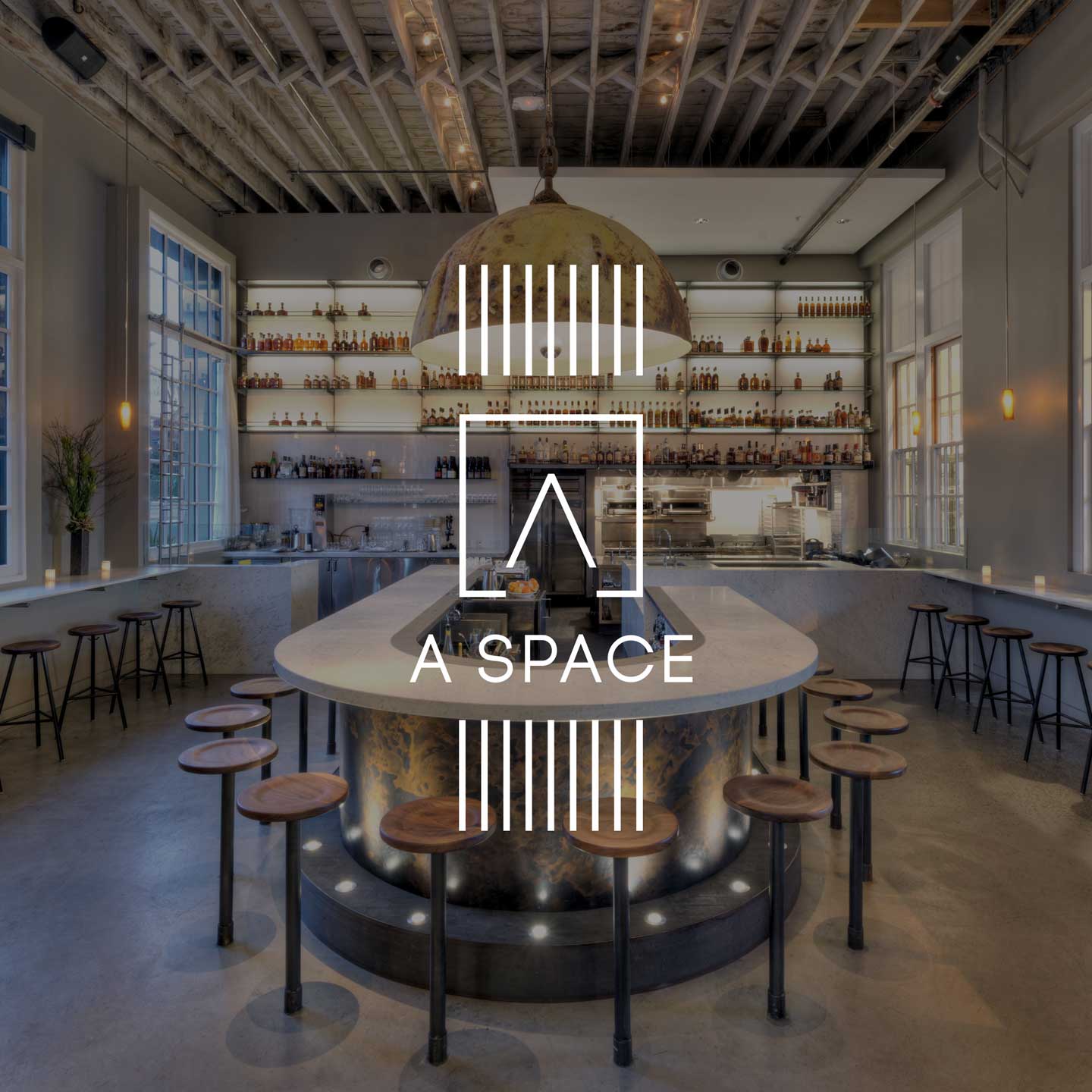
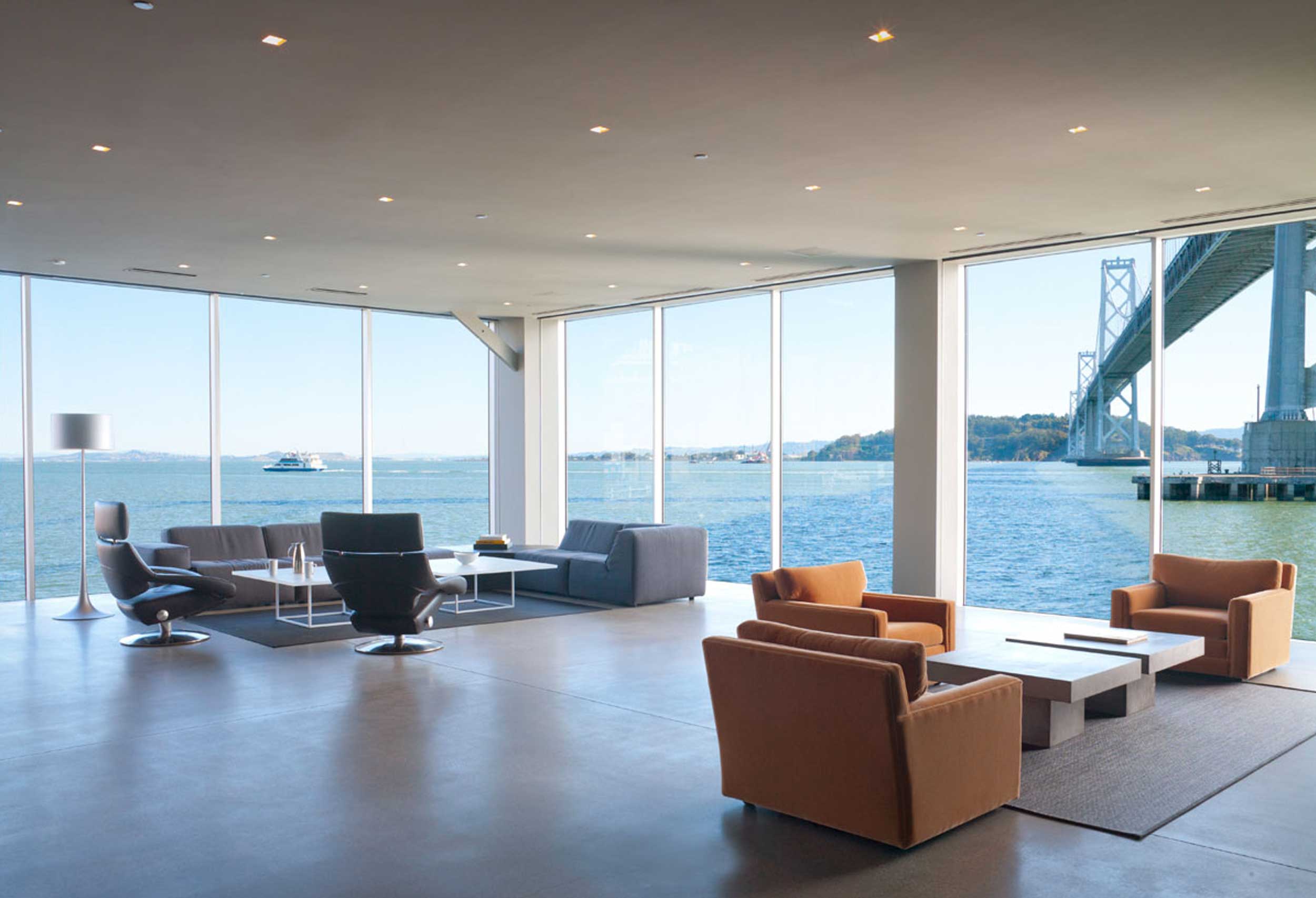
Clarifying a vision
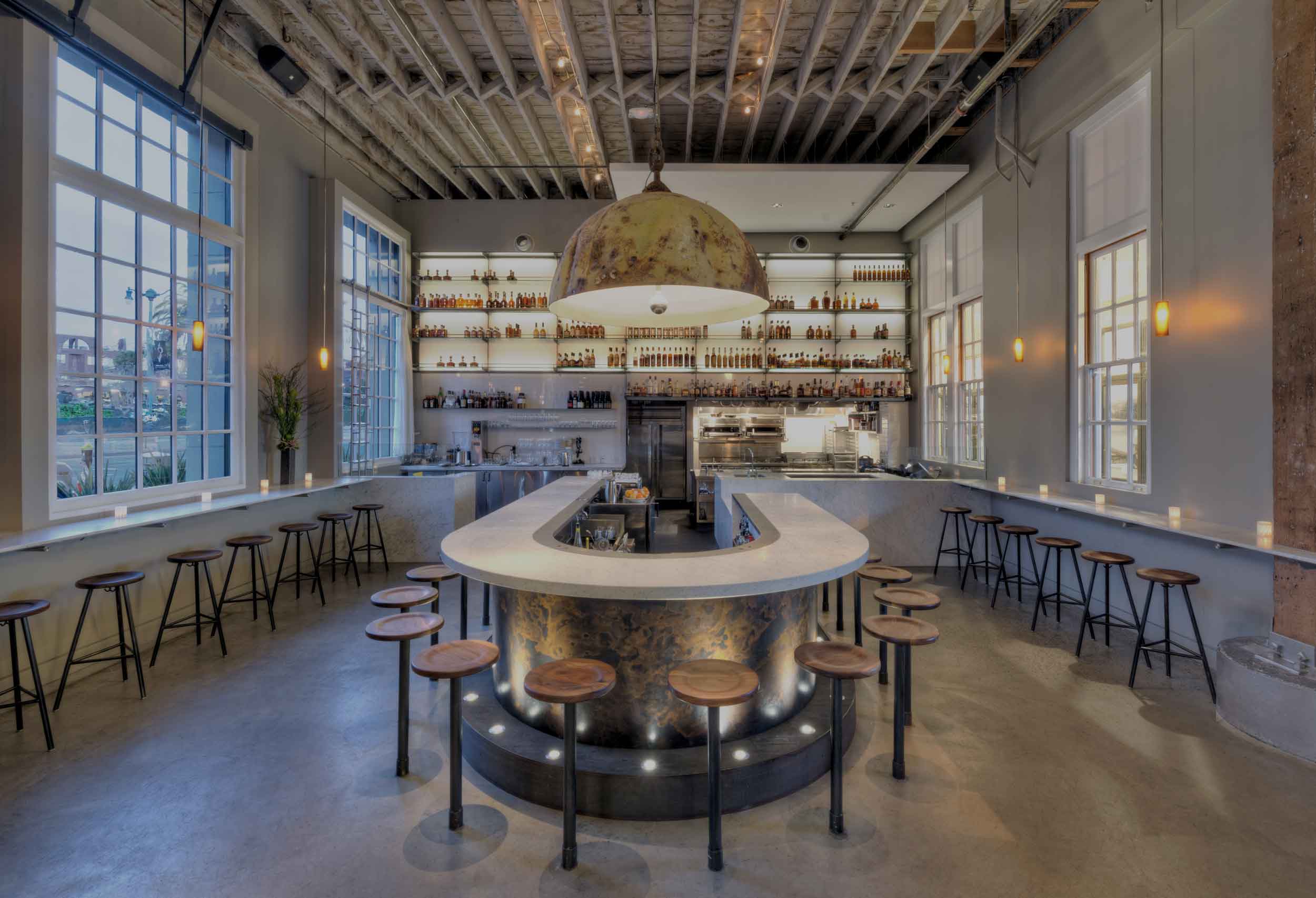
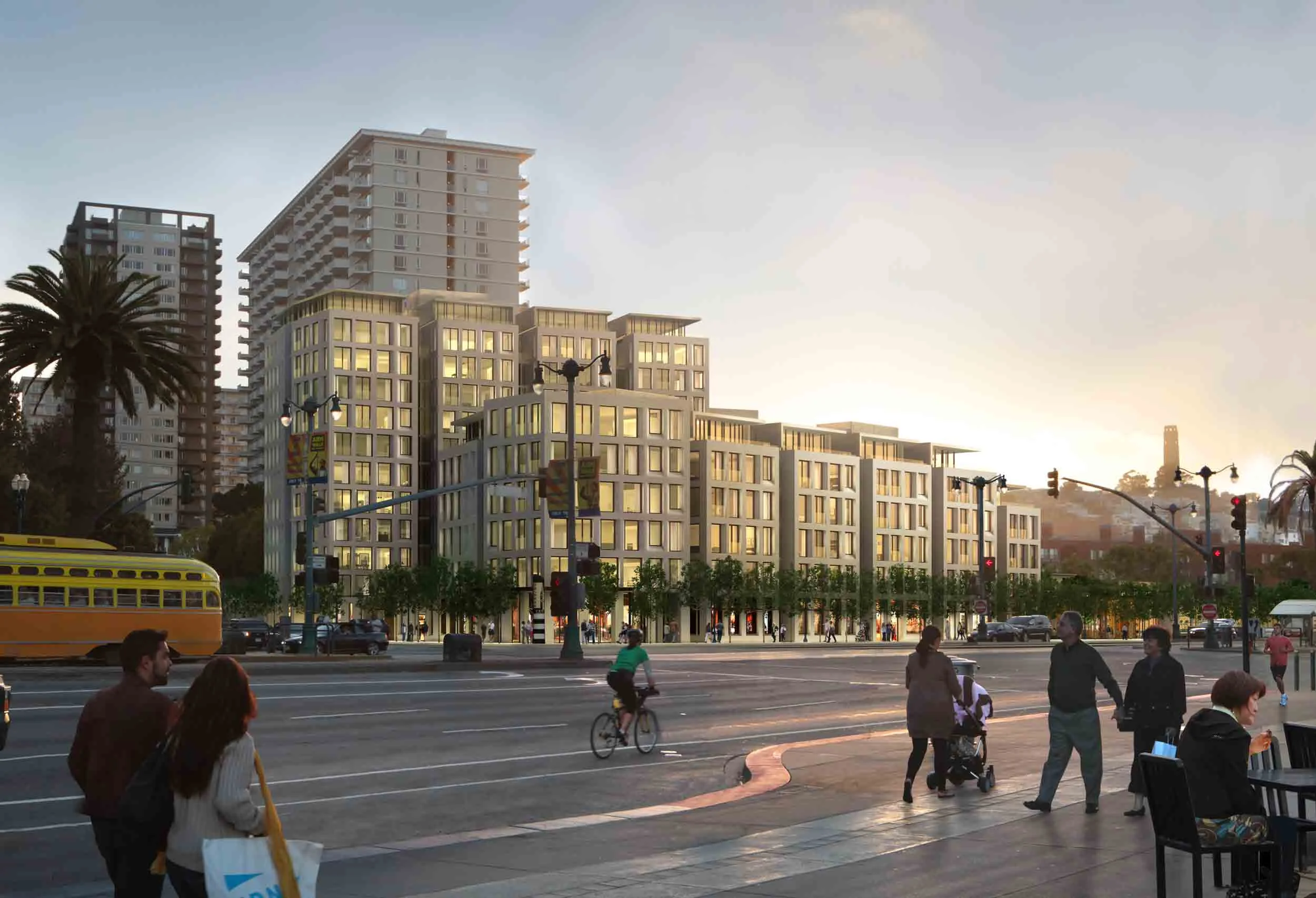
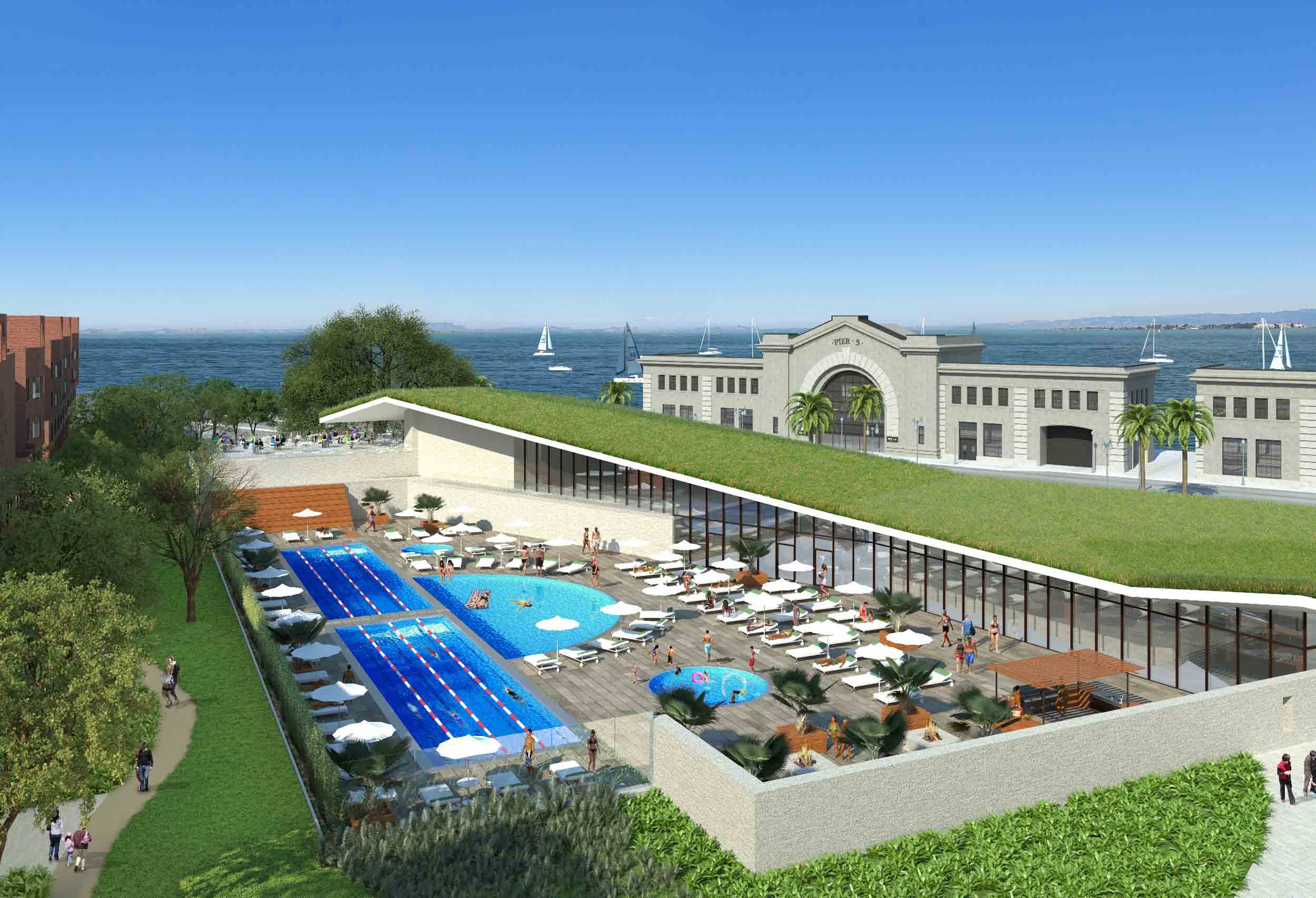
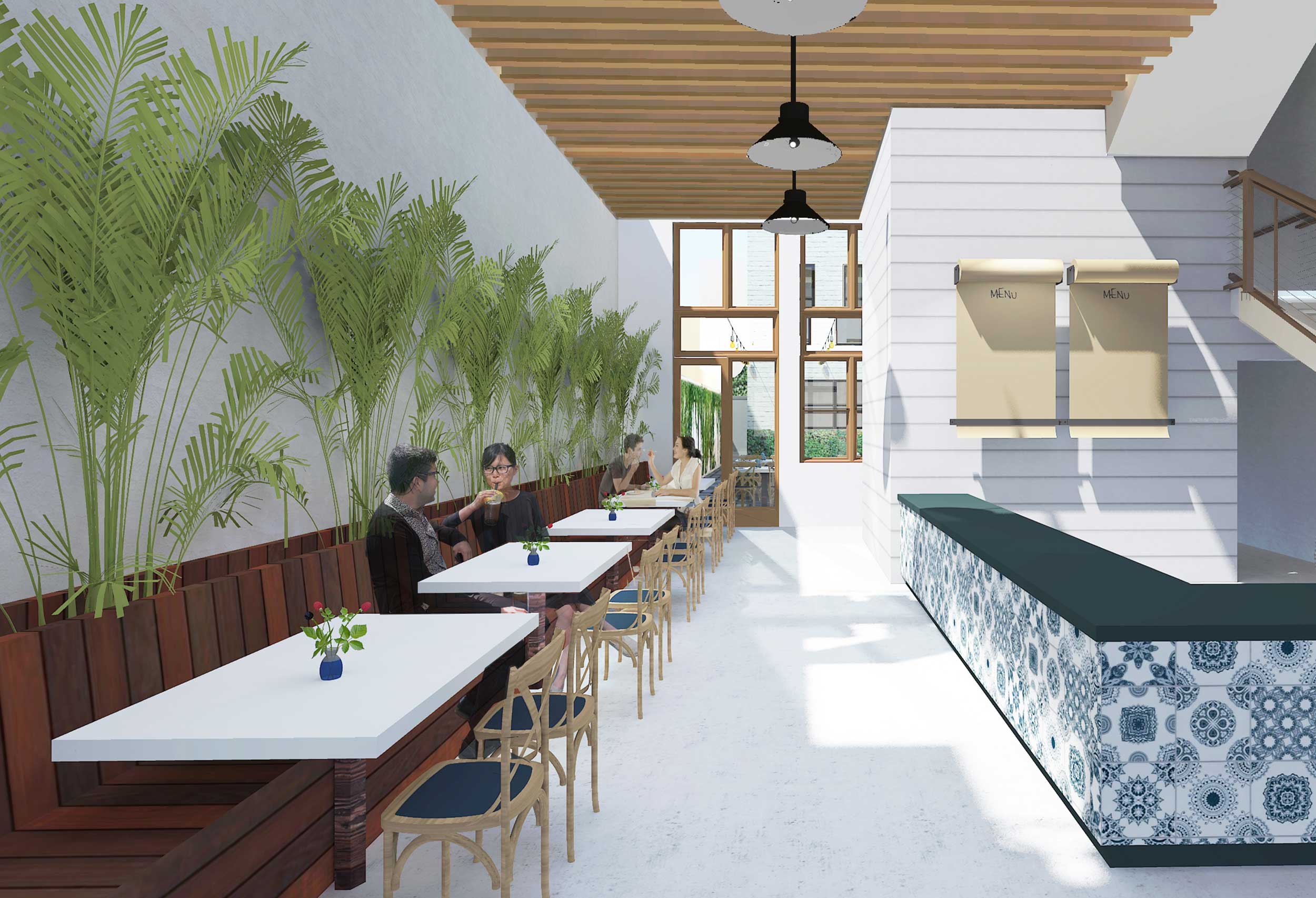
A Space Development wanted an online presence that told their story in a visual way. To do that they needed a more clear presentation. Not easy for a full-service property development firm. Enter MOJO. Our goal: deconstructing their objectives and elevating their presentation.
MOJO began by incorporating who and what they were into their logo: luxury meets real estate, architecture, engineering & interior design. With clients who are tastemakers, we wanted to ensure that every aspect of A Space Development’s design-build concept was recognized and communicated.


Next we created a tagline for their services that would not only greet prospective clients, but also encapsulate A Space Development’s ethos: Creation. Curation. Transformation. From start to finish, these are projects intended to create spaces that inspire - we wanted the branding to reflect that. Finally, we made sure that the philosophy and spirit of the company was front and center for easy consumption - because really, the work speaks for itself.
“I had the fortune of working with MOJO on my branding, logo, business cards and website. MOJO took the time to listen and learn about my specific business which translated into a brand and graphic that is incredibly distinct and representative of my firm. Additionally, I appreciated that MOJO gave me an accurate budget and time frame by we were able to accomplish our goals. I am proud of the work product that we created and will continue to work with MOJO as my business needs evolve.”
WEB WORK

SEE MORE PROJECTS