When less
is more
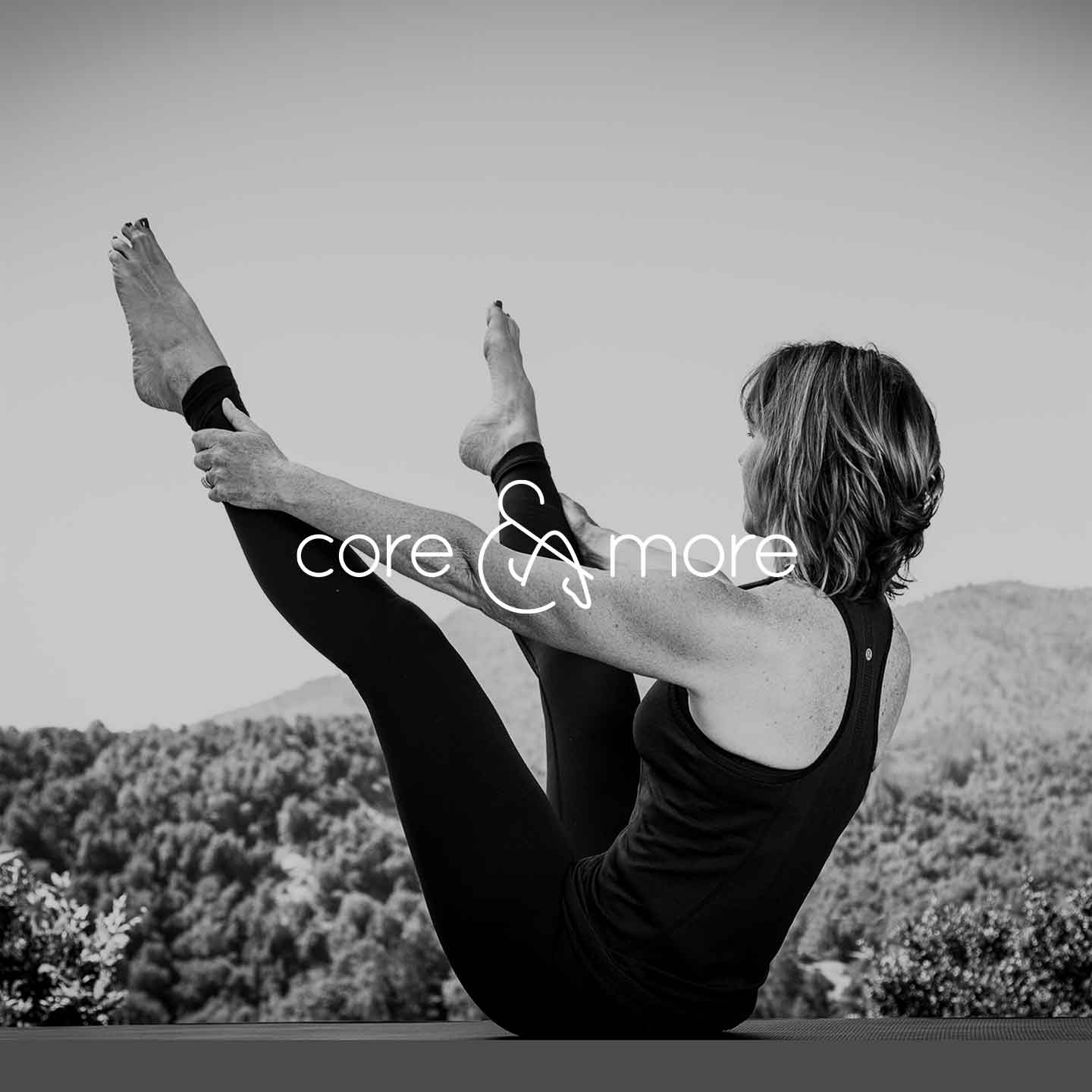
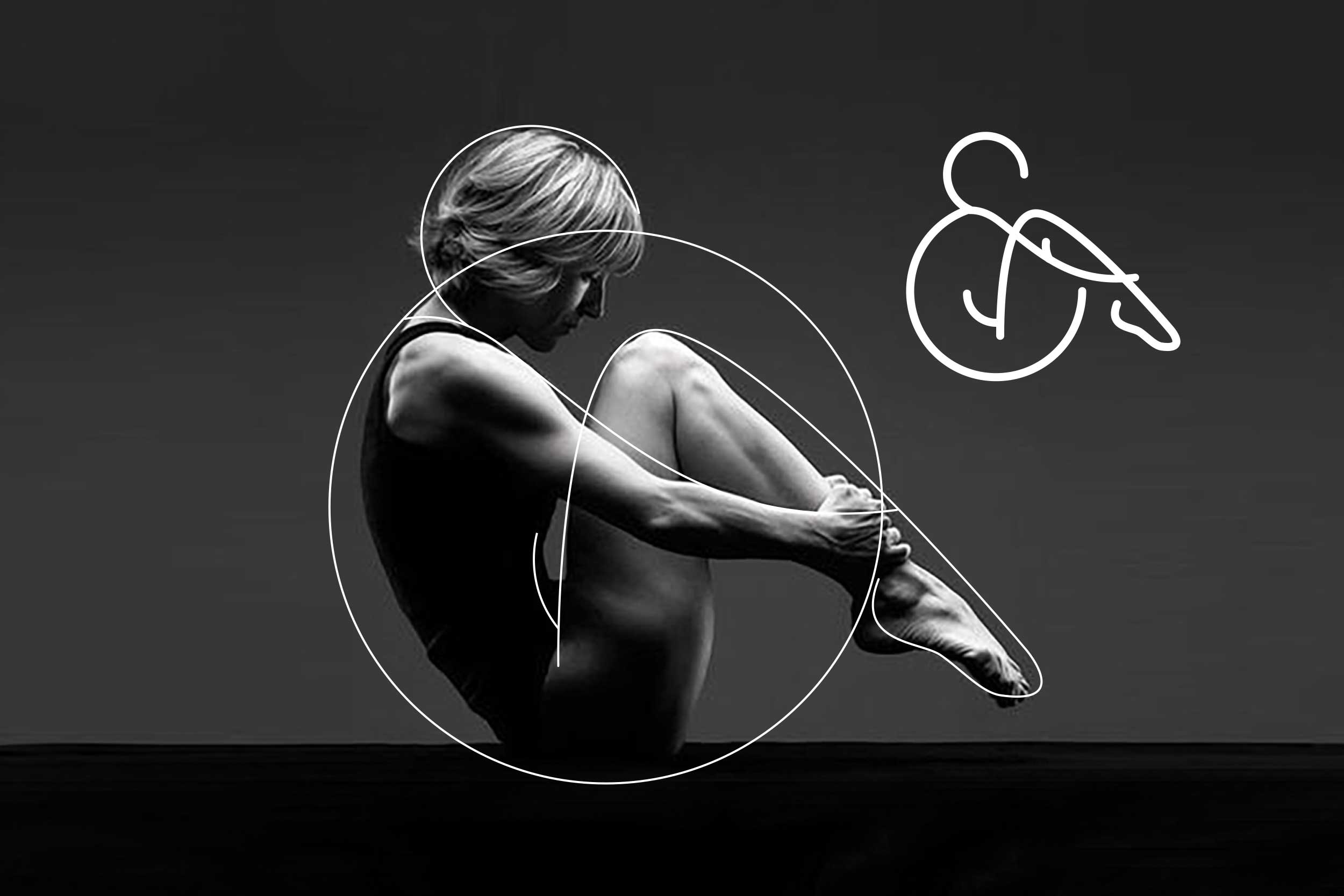
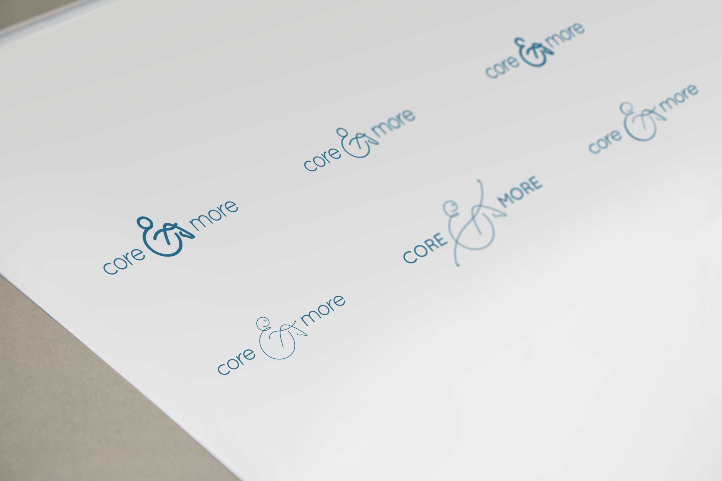
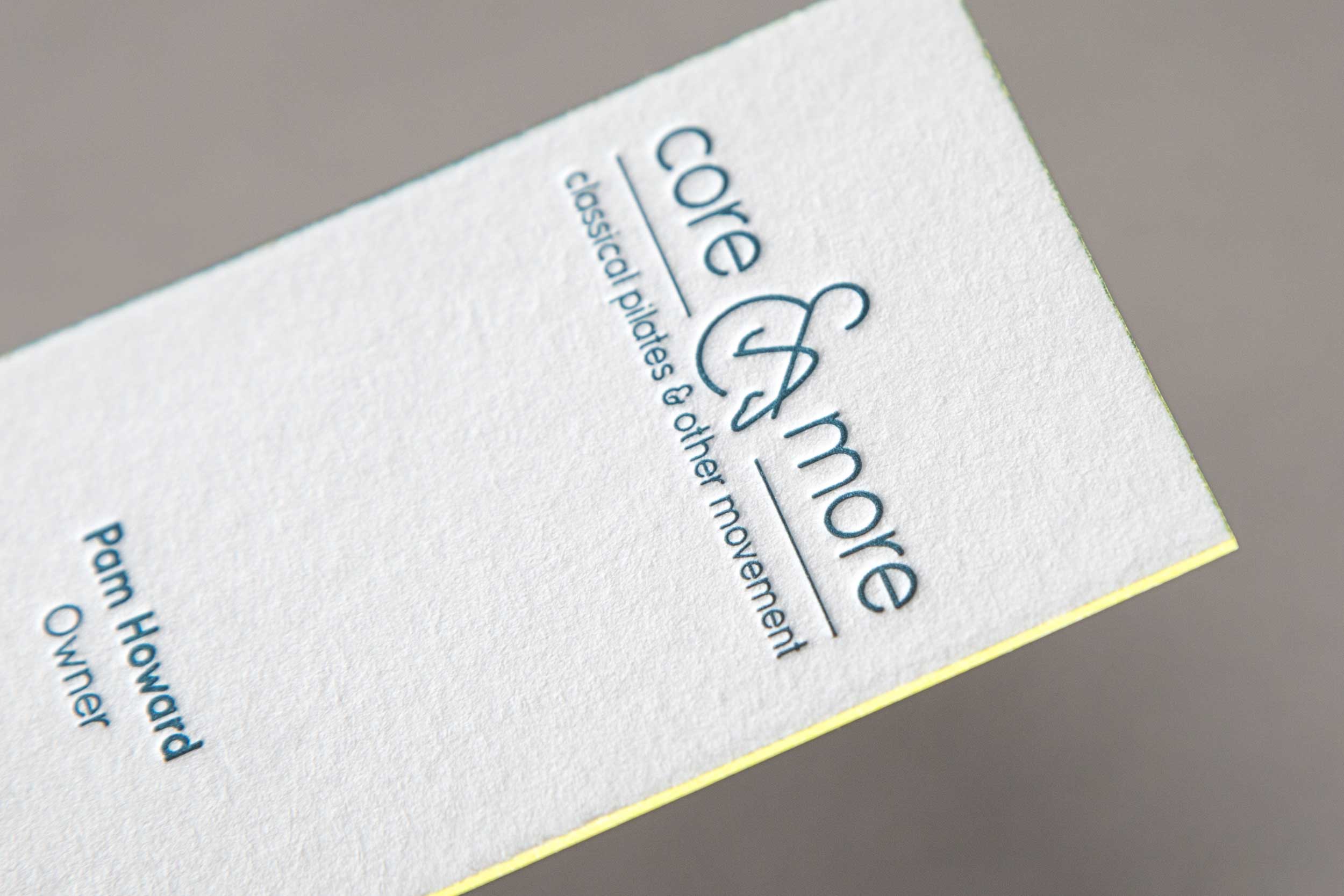
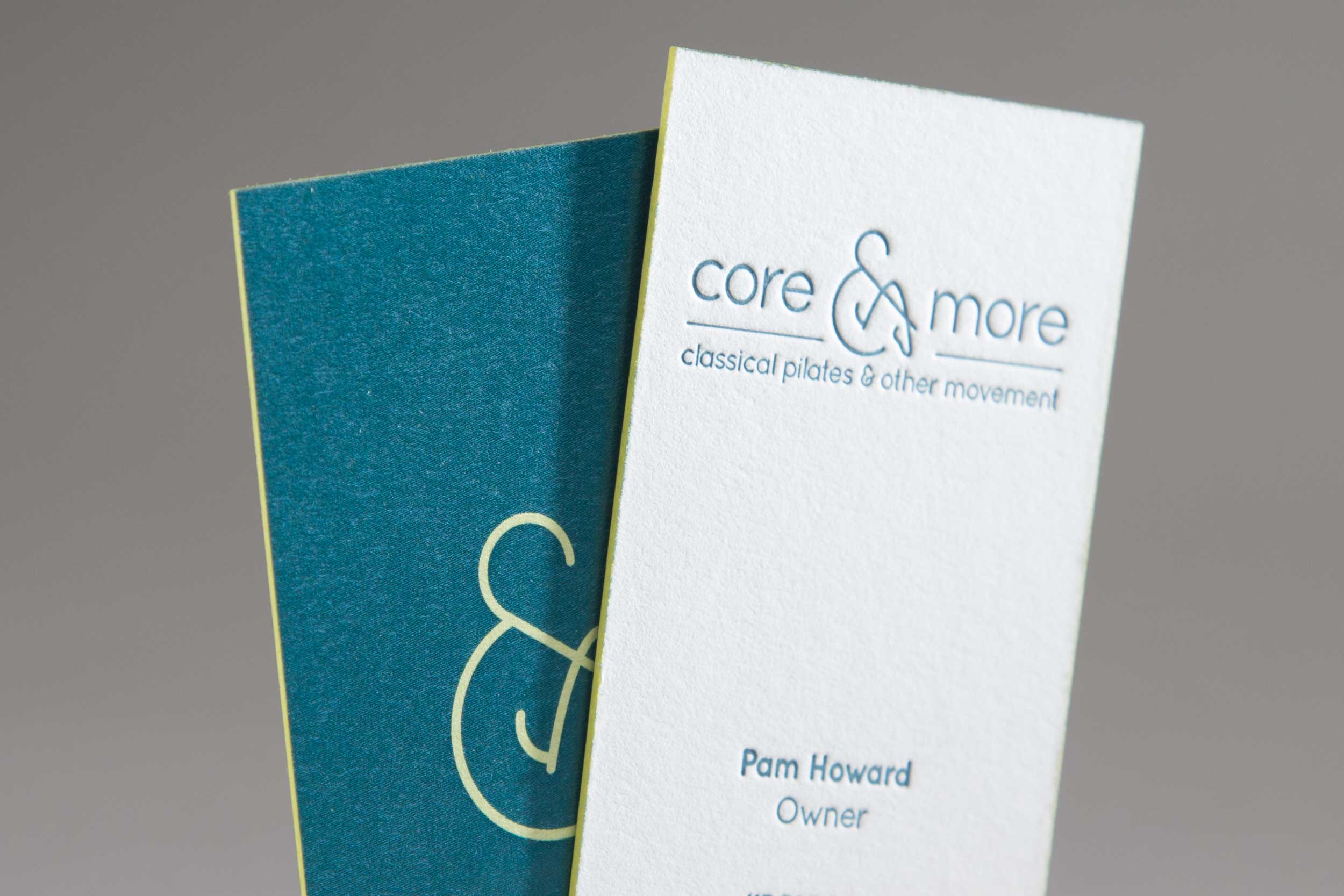
When MOJO was approached to support and advise a new business venture we were excited about sharing our expertise. We discovered that the studio held to the classical pilates technique, which we saw as a perfect jumping board for our vision. The logo in particular, became a direct reference to the precise style the brand wanted to convey - this in turn helped MOJO develop an overall brand design that is professional, compelling & peaceful.
Sometimes less really is more and this was one of those cases.
“MOJO was a pleasure to work with. Extremely professional, good attention to detail and follow through, and excellent taste. I’m thrilled with the results.”


SEE MORE PROJECTS