Discovering the aesthetic together
Sometimes projects are very challenging, and sometimes they just totally flow! Zalta was one of these projects - where everything fell into place perfectly.
The owners of Zalta had a very ambitious timeline to change their existing French restaurant into a completely rebranded and redecorated Mediterranean restaurant in just a few weeks! They needed a new logo, style guide, menu design and business cards. This schedule meant that I would be developing the branding simultaneously as they redesigned the interiors, which lead to discovering the aesthetic together.
When I think of the Mediterranean, I always think of blue and white. The interior design decisions that were already being made were in line with this so blue was clearly going to be the primary color. To bring in an element of warmth I added the sunshine color. The tertiary colors that I chose were based on the beautiful sand, stone and endless sky that the Mediterranean is full of.
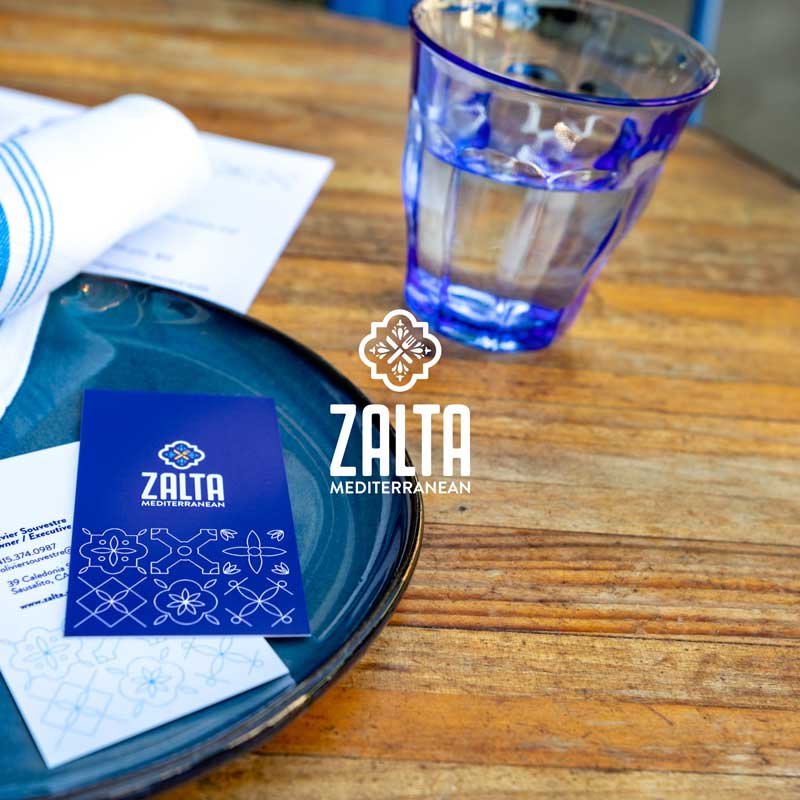
The restaurant was going to have an elevated casual vibe. My challenge was to balance whimsicality and sophistication. When the interior design process started all they had was a tile selected. I immediately knew that I wanted to use it as the logo inspiration and work in a knife and fork motif. The client loved the result and frankly so did I! It’s always fun to see your work on a big sign too.

For the business card, I went bold and blue for one side and on the reverse pulled a delicate pattern extrapolation juxtaposed against a minimal type choice.
This was such a fun project and I highly recommend dining at Zalta, where the interior is beautiful and the food is delicious.
“Loved working with Monique on the logo project. She understood exactly what we were looking for and delivered. Highly recommend.”
SEE MORE PROJECTS


