Back to the roots
When Anne LaFollette came to MOJO she needed a new look to match her growing business. Something professional, something unique, and something that encapsulated her brand.
MOJO immediately decided to draw from Anne’s own life. Connecting Anne’s childhood in Paris to the look of her brand quickly became our direction. This was especially significant to the crafting of her logo, which we wanted to be as warm and personal as Anne herself.
Inspired by Parisian signage and architecture, MOJO used hand-lettering to design a logo that felt special, charming, and spot-on for a company all about pattern design. A recognizable icon for Anne’s active social media presence came next.
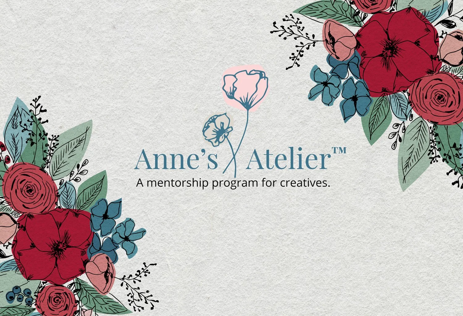
Anne loved the one of a kind logo so we used the look as a springboard for social media templates and other marketing materials. We also made sure Anne had a website that was flexible for shifting content and friendly enough that she could maintain it herself.
“I’m thrilled to share my experience working with MOJO because it was amazing! We collaborated on a complete website redesign together starting with my logo and reworking the flow of my website. We had so much fun together and Monique Johnson is brilliant. Every time we met for updates MOJO delivered incredible quality and I’m so happy with my new website. I highly recommend MOJO!”

Let’s work
together
You’re ready for a brand that feels like you—and attracts the right people. Let’s make it happen.


